Friday 14 October 2011

Katherine Hepburn

Somebody at work, upon meeting me for the first time, today told me that I looked like Katherine Hepburn. I don't see it myself, but this is pretty much the first time that anybody has ever told me that I look like a celebrity, so I have to admit to being weirdly pleased. Hey, at least I'll have somebody to refer to next time Facebook does a doppelgänger week, right? Hepburn is a very cool woman to be compared to, too.


She does an excellent line in sitting around looking louche, as you can see. I've always thought that my grandmother looks a bit like her, actually; severe, but in a regal, well-sculpted sort of a way. I still think most people would rather look like the other Hepburn, though.

Thursday 13 October 2011

Geometric System

I have a bit of a thing about tattoos; I have three myself, and I find them really appealing and visually compelling on other people. It's the one style choice that everybody feels prompted to explore and interrogate - when, where, why did you get it done? It's so cool that an aesthetic choice is capable of prompting so much fascination and so much intensity of feeling.

My husband is currently in the process of getting a full sleeve finished, and it's coming on beautifully. It's made up of three interlocking pieces, and I have taken a few pics of it as it has developed over the past few months.


The pieces will eventually all be joined together to create a coherent whole, and there's a lot more shading to complete at each stage, but I love it already. And I've noticed how bad ass it makes all of his outfits look; he just throws on a T-shirt and looks like a style icon. I'd say that's money well spent.

Wednesday 12 October 2011

They Don't Know That We Are The Media

I love love love Amanda Palmer. Dresden Dolls have their own capacious corner within my mental musical landscape, and her solo stuff is similarly bad ass. This song has been in my head all day, and seeing as it addresses a style / personal grooming issue, I thought I'd post the video here.


Yay! So good! Not the most sophisticated analysis of the issue I've ever come across, but it's certainly bold. Plus, those merkins are full-on works of art. 

Tuesday 11 October 2011

Wrap it Up: Winter Coats

To continue my current Winter obsession - where's the snow already?! - I thought I'd do a quick post on outerwear. There are some really gorgeous coats out there at the moment. I've tried on the blue Topshop number, but unfortunately my curves rather mess up its clean, masculine line. It would be a great choice for a woman with a more athletic build, though. I love the leather sleeves and the biker-girl detailing on the Full Circle coat (and it's an absolute bargain!), but the René Derhy coat has to be my favourite. 


Blue parka by Réne Derhy, €163

Full Circle wool mix coat from the current sale at Cocosa, £51

Boyfriend Coat by Topshop, £85
The blue parka looks soft, cosy, and forgiving, but it's also visually interesting. The colour is offbeat, the buckles are really cool, and it has that slightly mad, rich old lady feel that I am very much looking for in my clothes! I might consider buying it if a) the website wasn't so hard to figure out, and b) I hadn't already bought  my coat for the year. I went for Topshop's car coat. It's gorgeous, and I love the ovoid shape and big fur collar. It makes me feel super glamorous! It just bugs me that it's already so ubiquitous. Every other Brighton lass seems to have one...

Monday 10 October 2011

Activist Chic: I Protest!

When I first came across this piece about protester fashion in the 
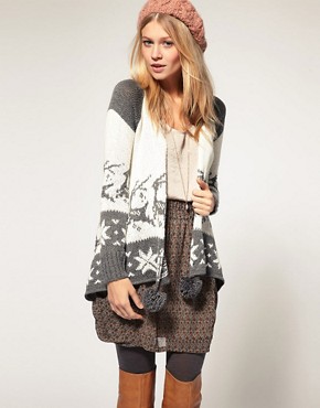
New York Times, my first reaction was to roll my eyes. As I clicked through image after image of activist street style, I couldn't help but despair at the evident desire to strip away any issue of ideology - to reduce protest to performance. Does it matter that Nicole Thomas, 22, is wearing a Victoria's Secret pajama shirt? Who cares whether Liza Tichenor, 30, is rocking a vintage pencil skirt? There are much bigger issues in play.

The piece fails on every front: the looks on display are largely functional and boring, so it doesn't work as a street style piece, and (more importantly) it works to trivialize the Occupy Wallstreet phenomenon. In reducing the protest to a string of outfits, it strips the protest of its ideological content and - as this article from the Telegraph demonstrates - makes it available for dismissal as absurd 'hipster narcissism.'

But, whilst it's true that reducing political engagement to a question of surface and style serves to undermine the protest in a troubling way, I would raise some queries about both my own knee-jerk response and the Telegraph's snortingly dismissive coverage. There is a tendency to assume that fashion is trivial, consumerist, and silly, but we cannot avoid sending messages via what we wear. Clothes inevitably signal something to onlookers about our viewpoints, our attitudes, and our identity, and whilst we are never fully in control of how we are 'read' by others, we do have a certain amount of agency in terms of shaping people's perceptions of us via the language of style.

Is it really so silly, then, to consider how the way that we dress might reflect, express, or draw attention to our politics? Whilst the execution of the New York Times piece leaves a lot to be desired, is there really anything fundamentally wrong with the idea of examining the aesthetics of activism? Handled more deftly, it might even be an interesting and illuminating exercise. More than this, though, there is a need to question the assumption that being able to 'think fashion' means that one is unable to think anything else with the requisite degree of reflection and analysis.

As a result of their being perceived as sartorially aware, the protestors are viewed as being, to quote Brendan O'Neill of the Telegraph, 'far more sussed about their clobber than they are about why they have taken to the streets.' This is quite unfair, given that the article was for the fashion section of the New York Times; I mean, of course the contributors are going to talk more about their clothes than about their political motivations. The journalists would have been steering and editing their responses in that direction. And it is, of course, far easier to talk succinctly about style than it is to offer a concise sound bite on the myriad problems of capitalism.

And the very idea that an interest in style suggests a diminished ability to talk about politics is founded upon some very limited ideas about fashion - that it's an inherently and totally capitalistic discourse, with no space for any other significant meanings. This is suggested again when O'Neill hints at the irony of the existence of 'anti-capitalist' brand lovers: '“My pencil skirt is vintage”, says one protester. “The sunglasses are Michael Kors.” Another chirps: “My top is American Apparel. The vest is Forever 21.”' Yes, certain conceptualizations of fashion play into ideas about passive consumption and blind consumerism, but the issue is also more complicated than that.

Firstly, a protest very often brings together people from varied backgrounds and with diverging perspectives; it is a strategic alliance of individuals coming together to agitate for a specific cause. They come together in a way which makes their individual differences temporarily irrelevant - a way which subsumes these differences in the interests of a common cause. In the case of Occupy Wall Street, the protest centres specifically on New York's financial services, and the huge profits being made by the bailed-out banks. To sympathise with this cause is not the same as taking umbrage with every aspect of the capitalist system. In other words, we should not be surprised to find fashion lovers at a protest; people who hate the banks without hating American Apparel should not be viewed as damaging the coherence of a protest movement, but with that spirit of hospitality which can prove so useful when it comes to mobilizing popular support. Their cognitive dissonance is their own business. For now at least, they act as allies in a shared cause and should not be stigmatized.

Secondly, there is a mess of complex associations between personal style and personal beliefs. An investment in clothing cannot be generally or uncritically equated with a particular kind of ideological stance. In particular, an interest in style must not be read as an indication of empty-headed hipster bimbo-ism (or himbo-ism). Why is it so hard to believe that someone might be able to care about both her hair and the global economic crisis? Style and politics are separate discourses which can, in some (albeit limited) way, intersect and inter-penetrate. I can only guess at the processes by which they come to be seen as mutually exclusive... one rarely finds journalists arguing that football supporters, for example, are ineligible to protest because of their interests, and sport is just as much of a trivial, money-driven preoccupation as style.

This post is quite an incoherent outpouring of half-baked ideas, but I just wanted to challenge myself to reflect upon my own reactions to the New York Times piece. If you ask me, there are three essentials when it comes to dressing for a protest: flat shoes for walking and/ or running, bag containing supplies and She-pee in case of kettling, and some kind of home-made armour fashioned from baking trays in case of police brutality.

Sunday 9 October 2011

Clutched to My Heart

I want this enormous multi-coloured clutch bag.


Image 1 of ASOS Leather Portfolio Clutch
Portfolio clutch by Asos, £33

It's leather, it's pretty, and it's big enough for all my crap. Plus, it's reduced from £55 to £33 in the sale. What more could you ask for?

Saturday 8 October 2011

X Factor Stylists: It's a No From Me

I know that the X Factor has never exactly been the paragon of chic (despite the fleeting presence of the epic Grace Woodward), but tonight I was struck by just how seriously awful the stylists made the contestant Frankie Cocozza look.


Stills taken from the X Factor website
Yuck! The whole look is just so monumentally mishandled. It's as if the stylists thought it necessary to strip away all elements of nuance and individuality in order to make Cocozza's "rocker" persona readable to the audience. He's like Ozzy Osbourne meets Marc Bolan - an atrocious mash-up of generic alternative styles. The low-slung belt, the leathers, and (most of all) all of those necklaces... it's all just so costume-y and lame. Come back Katie Waissel's perspex helmet, all is forgiven.

Friday 7 October 2011

Too Soon?

Today, it was dark before I got home from work. This was partly due to the fact that today was my first attempt at commuting to and from London, but the feeling of pootling along the cold, dark streets, peering into other people's houses, served to remind me of just how close we are to a brand new season. In that spirit, here are some excellent winter-y knits to enjoy as the nights draw in and the leaves keep falling. They make me think of ski lodges and hot chocolate and roasting stuff.

Image 1 of ASOS Reindeer Jumper
Reindeer Jumper by ASOS, £40
Geo Reindeer Top by Forever 21, $19.80
Image 1 of Vero Moda Reindeer Pom Pom Knit Cardi
Vero Moda Cardigan at ASOS, £45
And one (very overpriced!) little number for the boys...

Gant Mens Reindeer Jumper
Gant Reindeer Jumber at Very, £150

Thursday 6 October 2011

Specs Appeal!

Today I invested in a new pair of glasses. I seriously reckon that specs are one of the hardest things to shop for; you get so used to your usual face furniture that even a slight change can feel really weird. Plus, they are a massively expensive (yet hugely unglamorous) thing to fork out for.

Fortunately, there are a couple of good independent frame stores in Brighton, stocking a range of offbeat and interesting options. I was looking for a pair that would give me that design-y, architecture lecturer vibe; chic, strong, and cool. I'm not sure if I quite achieved that, but the ones I selected did have a certain Great Gatsby / 1920s Oxbridge student feel about them, which I liked. With their more rounded shape, I think they'll be the perfect companion pair for my current angular nerd specs. I'll be sure to post a photo once I've picked them up.

In the meantime, feast your eyes on the lushness that is the Anglo American eye-wear collection. I tried on loads of these, but sadly they all seemed to big for my pointy little shrew face. My husband got himself a lovely Buddy Holly-style pair, though, in a beautiful matte black finish. I'm very jealous.
The specs themselves are very stylish; it's a shame that the company's website is so dodgy, though. Come on, Anglo American! Up your game!

Wednesday 5 October 2011

Rainbow Androgyny

Here I am tempering bright blue tights, purple brogues, yellow houndstooth check, and a ginger hair explosion with a crisp white shirt and a masculine Crombie-style coat.


As with my take on neon loafers, what I enjoy about this look is the slight feeling of disharmony; sharp masculinity and a streamlined, even Mod-ish, element combine with a vivid and colourful palette to create something else entirely. Plus, I'm wearing bunches! What's not to like?! It's all jolly good fun.

Tuesday 4 October 2011

Give Me Athena, There's No Meaner

Just a quick post in praise of super-group Wild Flag, who remind me of some of the best and most passionate riot-grrrl loves of my youth. This is due in no small part to the presence of Carrie Brownstein and Janet Weiss of Sleater-Kinney, upon whom I once inflicted myself at a London gig. I was very, very gushy, and they were clearly highly uncomfortable and keen to be left alone. Wise, wise women.


I still have a signed Sleater-Kinney vinyl sleeve tacked up inside one of my cupboard doors, so that I can admire the ladies looking fine in Oregon-appropriate knitwear any time I want. Man, I used to make a real effort to dress as if I was on the 'You're No Rock and Roll Fun' single cover back in the day - hooded duffel coats, striped scarves, and knitted hats a-go-go. It is so nice when your icons (and their personal and musical styles) stand the test of time.

Hurray for Wild Flag, then! Long may they rock!

Monday 3 October 2011

Manufactured Imperfections

I've been thinking about this news report from CNN, which suggests that there is a trend for crooked teeth gripping the young women of Japan. A dental surgery in the Tokyo district of Ginza has apparently started offering stick-on sets of wonky gnashers, so that naturally-blessed people can finally achieve that less-than-perfect look. The argument put forward in the article is that these crooked teeth are desirable precisely because they make the wearer less attractive - that 'bad' teeth can help to make beautiful women seem more approachable. Hmm.


There is a sense that the article is attempting to appeal to its readers' sense of novelty; 'Oh, look at those crazy foreign people and how wrong they've got their approach to dentistry! Who would elect to make their teeth worse? Can you imagine aspiring to be ordinary? Ha ha ha!' But the manufacturing of apparent imperfections is not a uniquely 'Other' phenomenon. For an America's Next Top Model nerd like me, this story immediately called to mind Chelsey from Cycle 15. In her case, the gap between her front teeth was deliberately widened (by Tyra's royal decree, of course) in order to give her a different look. Nobody within the show - the judges, the 'clients', Chelsey herself - even raised an eyebrow. Indeed, as this article in the Guardian makes clear, imperfect dentistry (including overlapping veneers) had its popular moment in the US, too. With this in mind, it hardly seems appropriate to marvel at the difference of the Asian other.

Chelsey from America's Next Top Model
The motivations assumed to be behind American's mouth makeovers are notably different to those ascribed to Japanese consumers, though. The Guardian piece talks about the gap-toothed smile as being 'one of fashions most sought-after accessories' and references 'unusual beauty' and 'unconventional looks.' In the case of Chelsey, of course, the atypical dentistry was intended to make her more 'high fashion.' In the case of the Tokyo women, however, the 'fad' is assumed to be the result of something like the inverse of this tendency. It is not seen as a bold, avant-garde aesthetic choice - an attempt to seem beautiful in an extraordinary or an unconventional way - but as an attempt to erase that which might be seen as extraordinary. Western women, the differing coverage suggests, adjust their teeth to appear stunning, whilst Asian women adjust their teeth to seem less confrontationally, intimidatingly beautiful.  

Why exactly these two tendencies - based on pretty much the same idea of manufacturing what one might think of as dental imperfections - should be viewed as being based on two such different motivations I am not quite sure. Certainly there wouldn't at first glance appear to be any obvious reason why 'yaeba' (the Japanese term for wonky teeth) should be any less related to obtaining culturally accepted standards of beauty than the diastema canyon. A gap toothed grin deviates just as much from the all-American smile as does a look involving accentuated canines. As Giant Robot suggests, the crooked smile is available for interpretation as truly beautiful - it's 'cute' when 'everything looks like shards of porcelain.'


Why the difference in emphasis, then? It seems that there are certain discourses of race circulating here - the passive and infantilized Asian female versus the red-blooded and hyper-sexualized Western woman. The white woman opts for weird cosmetic dentistry to seem more unapproachable, the Asian woman does so in order to seem less so. I think the differences in the way manufactured imperfections are reported and discussed needs to be analysed with a critical eye. We need to question those discourses of 'otherness' which ignore points of convergence between cultures. We also need to acknowledge the divergent ways in which we discuss the manner that women of different racial backgrounds subscribe to culturally-defined ideas of the beautiful.

Sunday 2 October 2011

Starry Eyed Mascara Eyes

I am feeling the love for my Lancôme Hypnôse Precious Cells mascara today, so I thought I'd share. I bought it for my wedding, when I was investing in some more luxurious cosmetics, and I have to say that the stuff has really worked out for me. It's neither flaky nor smudgy, lasts for ages, and (most importantly of all) does wonders for my usually inconspicuous lashes. Here I am going for a slightly exaggerated, 1960s-type of look.


The manufacturers claim that it helps to encourage natural lash growth, but I certainly don't see any effect on that front. Then again, I rarely wear mascara; I never bother with it if I'm wearing glasses, and I would say that blusher and concealer are far more central to my everyday beauty regime. One application a week is hardly likely to provoke an instant Rapunzel-effect! The one potential downside is that the stuff tends to clump a little bit if you go for multiple coats; I didn't mind a bit of clumping for this kind of heavier look - it actually sort of adds to it, in my opinion - but it could prove irritating if you were going for a more natural vibe.


Make up is obviously a hugely personal thing, and this mascara might not be every woman's cup of tea, but I think it's fantastic. It's creamy, nice to apply, and smells really lovely in a way that a lot of the cheaper brands just don't. Plus, a coat or two on my bottom lashes provides a much-needed distraction from my ever-expanding eyebags... a winner all round, as far as I'm concerned!

Saturday 1 October 2011

Colour, Collars, Carven

The Carven Spring 2012 collection, shown as part of Paris fashion week, is really lovely. The evening wear looks are fresh and unexpected, the chunky shoes (though reminiscent of a lot of the flatforms around this season) give the looks an intriguing masculine edge, and the bold cut-out detailing gives the collection a sense of vitality as well as continuity and coherence.


The collection features some super-short silhouettes, which obviously look gorgeous on the models. Equally obvious, however, is the fact that my purple-white sausage legs would look infinitely less desirable in this abbreviated variety of skirt. Ditto the unmade-up faces. There are some elements of the show which do really tap into my current style preoccupations, however, and which I therefore both covet and wish to approximate in some kind of budget version.

I'm very keen on the golden / mustard tone which punctuated the second third of the collection. It's not a colour I would usually experiment with, but Carven made it look so sumptuous that I might just have to give it a go. I think that the palette in general is pretty delicious (not to mention the prints!); it manages to retain a real sense of femininity whilst also seeming bold, strong, and modern.


I also love the way that shirt collars can be seen peeping out from the necklines of dresses. I have tried this kind of look before, but always in a more winter-y way - white shirts buttoned to the neck beneath grey woollen dresses or pinafore-type numbers. Here, however, not only do the colours help to make the outfits more season-appropriate, but a number of the collars themselves are autonomous. That is, one need not wear a shirt in order to get the collar effect, but can just wear the collar separately - shirtless collars rather than collarless shirts! I think that's a genius idea for when the weather turns hotter and nobody wants to layer up.


In short, I really like the whole collection. Well done to Guillaume Henry. I want to finish off with an outfit that manages to encapsulate all of my favourite elements, and which I will have filed away in my noggin as style inspiration come spring. I love the colours (the mustard with the blue lace against the baby pink, combined with the acid bright shoes), I love the buttoned up collar, and I love the very neon librarian feel about the whole look!